Center For Early College
Notes on a Brand Variation
April 7, 2017
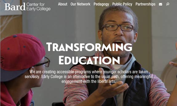
I designed and developed the Bard Center for Early College (CEC) website, a new organization that spans Bard College campuses. The CEC team steered the design to be consistent with the Bard College at Simon’s Rock site. They wanted the two sites to have consistent typefaces, visual layout, and general look. I used that direction as a starting point, and made a few changes to meet the distinct needs of the site. In this article, I’m going to describe some of ways that the CEC site differs from the Simon’s Rock site and how I approached the design.
Switching and Branching Code Base
First off, before I made any changes to the code, I branched the CSS and JS from Simon’s Rock so that future updates could apply to one or both code bases. I’ve written about how to branch CSS using Sass. I did something similar with the JS using Grunt to compile different combinations and variations of JS partials. With this system, I can change a CSS or JS partial, and the change can easily be applied to one or both site’s final compile.
Simple Top Navigation
The CEC site doesn’t have the expandable mega-menu of the Simon’s Rock site. The mega-menu is a good way to give quick access to a bunch of links. However, it also forces an extra interaction to get to a new page from the menu. And it is tricky on smaller devices as well as touch devices. On Simon’s Rock, we solved this issue by only enabling the mega-menu on larger devices, giving a different navigational experience depending on screen size.
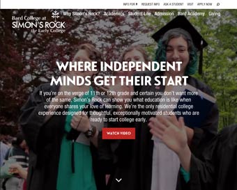
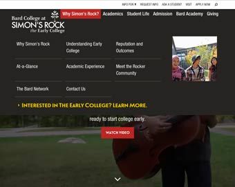
Since the CEC site has much less content (it launched with 20 pages compared to Simon’s Rock’s 500), I decided that a consistent simple menu was the way to go. Clicking on the menu goes directly to the link instead of expanding the mega menu.
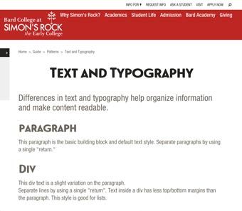
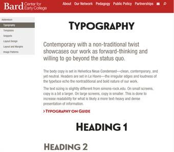
Typography
The CEC site uses the same typefaces at slightly different sizes. The CEC site promises to have content that is more text heavy and less art directed. Additionally the message is a touch more professional and classic, addressing educational professionals instead of 15 year-old prospective students. It is important that long blocks of text are highly readable and don’t rely on other design elements. In order to accommodate this, the type-size is slightly smaller on larger screens and slightly larger on small screens.
Note, after launching the CEC site, we decided to incorporate some of these typography changes into the Simon’s Rock site. Since the code is branched from a single repo, this conversion is easier than if we had two separate repos.
In addition to type size, I reduced the width of a paragraph, in an effort to increase readability. Changing the width affects the margins and has a bunch of cascading implications on layout. With more design time, I would develop some more patterns taking advantage of the new layout.
space for secondary nav to display
Secondary Nav
The CEC site also changes the secondary nav and breadcrumbs. Since the CEC site is only 2 levels (compared to Simon’s Rock’s 6 levels) and it is unlikely to grow past three levels, there is space to combine the breadcrumbs and secondary navigation into a single visual entity. There is more space for the secondary nav to fit in the left margin since the text takes up a smaller width, so it appears in full view on viewports where it is only visually hinted at on Simon’s Rock. With smaller viewports on both designs, the secondary nav sits at the bottom of the content.
These changes meet the unique needs of the CEC content, while keeping the overall brand look and feel, as well as foundation of code.
Learn more about creating effective media, view my Production Remarks.