Evolution of a Logo
My creative process for designing the R-Pi Day Logo
February 15, 2014
OBJECTIVE:
Design a logo for a giving day taking place on pi day for Rensselaer.
The logo should play off Rensselaer's general logo. I've been tasked to prioritize recognizability and consistency.

Sketches
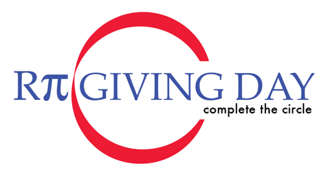
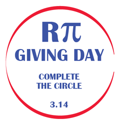
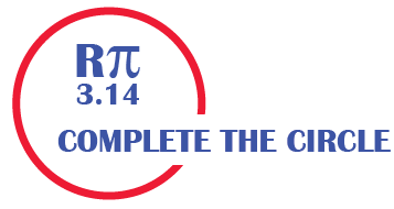
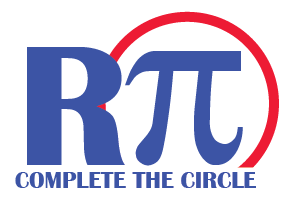
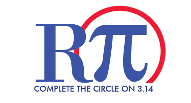
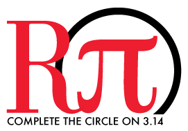
Mulling it over, I decided to play with the idea that pi is all about circles. I came up with the tagline “complete the circle” which hopefully implies the circle (cycle) of giving (students get aid, then graduate and become successful, and then give back). Also the benefits of giving is cumulative, each piece adds up, but ultimately your gift is the needed step to complete it.

Options
I’m happy with what I’ve got. I’ll try something a bit more stylish, but less branded and let the client choose the direction.


And the client chooses:

Done. Export. Create the website. The event set an an institional record for donors and dollars in a single day and also won the 2015 National CASE Circle of Excellence Silver Medal for best uses of social media in fundraising.
Learn more about creating effective media, view my Production Remarks.