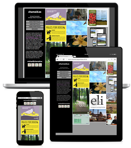
Portfolio Redesign
Notes on an iterative improvement
November 20, 2014

In 2010, I launched the second iteration of my website portfolio and after four years, it is time for me update the design.
Key Problems
-
The Lightbox deployment provides a less than optimal mobile experience. The site uses a Lightbox to transition between thumbnails and full size images. But on many small screen device, the thumbnails and the full size are the same size. I could turn off the Lightbox on mobile devices, but some of the content and navigation is embedded within the Lightboxes.
-
Fixed width columns provide a less than optimal experience. The site has responsive features—the window width determines the number of columns, but the width of the individual columns are fixed.
-
The design doesn’t allow for detailed descriptions or clear groupings of work.
Solutions
I like the general minimalist design of the site. The lack of color makes it easier to display various work without worrying about it clashing with the site’s color palette. I like the Google Images format where thumbnails reveal larger content blocks that include a larger image as well as details. I think this format works well on a variety of screen sizes and is also a recognizable pattern for the user to intuit. I found Grid Gallery on GitHub which employs a similar solution. I forked it and added a few tweaks.
- Reduced the gap between images
- Turned off redundant images on small screens
- Turned off redundant arrows on small screens
- Added titles to the navigations arrows. Mouseover the > arrow and it says, “next”.
The switch from the Lightbox to the Grid Gallery formed the basis of the third iteration. I made content changes to fit with the design. I broke up the portfolio elements into more specific sections, with deeper navigation. I also included more details on the pieces.
I hope the new design works for you and stay tuned for iteration #4.
Learn more about creating effective media, view my Production Remarks.