Developing Responsive Emails
A Gmail First Approach
October 16, 2014
Use progressive enhancement when developing emails. Start with the simplest presentation of information and then add features for users that can access them. I begin with the Gmail app because it doesn’t recognize media queries or any external CSS. So instead of mobile first, it’s Gmail App first.
Make a ‘phone width’ or a ‘desktop width’ table###
For email clients that don’t accept media queries, determine the width and structure of the email. Arguably, you don’t need media queries to make your email responsive. You can use inline CSS to set fluid width elements and make a responsive email that is optimized for multiple widths. However, many email clients ignore divs or don’t allow divs the way you would use them in standard HTML. So all layout elements need to be done in tables. I’ve set up some table-based layouts to be fluid, but it’s tricky. It’s much more predictable to set the tables as fixed width.
Assuming I’m going with a fixed width, I decide if the Gmail version should be optimized for a phone or a desktop. If it looks perfect on an iPhone it might look a little thin on a desktop. Or if it’s perfect on a desktop, it might require some pinch and zooming on a phone.
Determine Number of Columns###
The number of columns will have an impact on the width of the email. A single column is my design default. With multiple columns, the layout is more cluttered and content is competing with each other. I prefer to pick a primary message and deliver it to the readers with a single column. However, there are content objectives that are better served with multiple columns. The more columns I have, the more likely the email will need to be wider. Text is easiest to read when lines are 45 – 75 characters long, and I use that as a guide for the width of my columns.
Build Your Email With Inline CSS###
Build your table-based layout.
- Use inline CSS - see Mail Chimp’s inliner tool
- No floats - Microsoft Outlook does not accept them
- No margins - Microsoft Outlook does not accept them
- No divs - Microsoft Outlook does not accept them
- Use code from a pattern library
- Create bullet proof buttons
- Get starter templates from MailChimp, Zurb, or Campaign Monitor
- Get inspiration from Really Good Emails
- Use Grunt Email Workflow to automate inlining, templating, sending test emails, and litmus integreation. Use github for version control and collaboration.
Then test in the Gmail App on a range of devices
Add Your Media Queries###
To optimize your email for a range of devices and screen sizes, build out your external CSS and media queries for email clients that accept them. Yahoo will misapply your media queries so use attribute selectors to trick Yahoo into not using them. Use table[class=“mobileHeaderWidth”] or a universal [class=“mobileHeaderWidth”].
CSS & Styles
- Use the Email Client CSS Guide to decide on which code to use.
- Identify which email clients to serve based on your analytics or the overall marketshare.
- Wrap your entire content in a table with a class because Yahoo erases the <body> tag. Then use that class as a modifier.
- Set body width and the .wrappertable to be the same width to prevent centering issues in Hotmail.
- Yahoo ignores align=“center”. So use the style=“margin: 0 auto” and/or style=“table-layout: fixed;”
- Remove table spacing with table cellspacing=“0”
- If extra spacing appears between td, try removing extra spacing in the HTML
Images
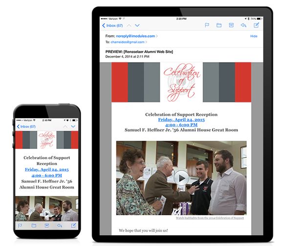
Many email clients hide images by default. If you put essential content in an image, the content may not be displayed. Alt tags can be used as a fallback. For a list of email client image functionality, review Campaign Monitor and Litmus.
We found that – with some industry specific exceptions – emails with three or fewer images and approximately 20 lines of text result in the highest click-through rates.
- Use short ALT text. The Alt text will disappear in Apple and Gmail once the size or length of the text exceeds the width and/or height of the image container.
- Break up ALT text into multiple lines with white-space: pre-line
Typography
You can use typefaces beyond the desktop standards, but there are many instances where the fonts won’t render. Make sure to include a font stack of standard desktop fonts.
Testing and Send
At this point, your email construction should be close to complete. Test on a range of devices and email clients. Adjust as necessary.
Learn more about creating effective media, view my Production Remarks.