Mobile First
Notes on designing giving.rpi.edu
April 7, 2014
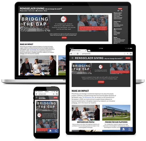
In April 2014, I completed the front-end design for Rensselaer’s Giving. Below are my remarks on the process.
Initial Design
Rensselaer Giving is one of many Rensselaer websites and the new design should be consistent with the general Rensselaer brand – both web and print. There isn’t a formal style guide, so I used one of the newer websites, Rensselaer News, as a starting point.
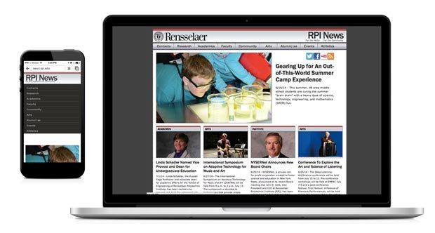
The site is representative of the Rensselaer brand.
- Frequent use of gray, as well as red (the school color)
- An aerial shot of campus at the footer
- Sans serif humanist typography
- More professional than fun, more modern than classic
Reviewing the site, I decided that I would tweak the design to optimize the content. A minimalist approach would make the site more digestible and help priority content to stand out.
- Add prominent donate button and social media buttons (main objectives for this website)
- Hide the menu items on mobile
- Less red (less branding in exchange for a cleaner design)
- Combine Rensselaer and site name into a single header (less branding in exchange for a cleaner design)
- Removing gradients (cleaner look)
Menu Structure
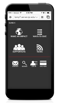
For the redesign, I set up the menu to reflect different paths a user might take to make a gift.
- Why should I give? (Make an Impact)
- How can I give? (Ways to Give)
- How can I give through a specific affiliation? (Supporters)
- I’m a regular visitor, now what? (News)
Breakpoints
Rather than rely on predetermined breakpoints based on a standard device, I used the horizontal spacing of the header to drive the breakpoints. There is a minimal header for small viewports. On medium viewports, the header text is horizontal and the tagline is added. For larger viewports, there is a larger font-size and the navigation links appear below the text.

Page Types
I designed two page types for different content purposes.
Directory Page
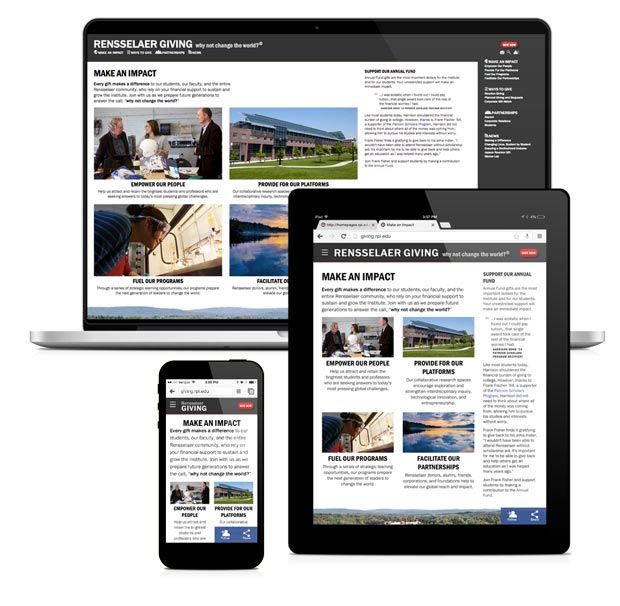
For landing pages where we know little about the user’s goal, directory pages provide a grid of choices. The user can easily scan the page and decide where to go. I developed a pattern library with code examples of grids of various numbers of columns and text alignments. The paragraph captions are optional.
Article Page
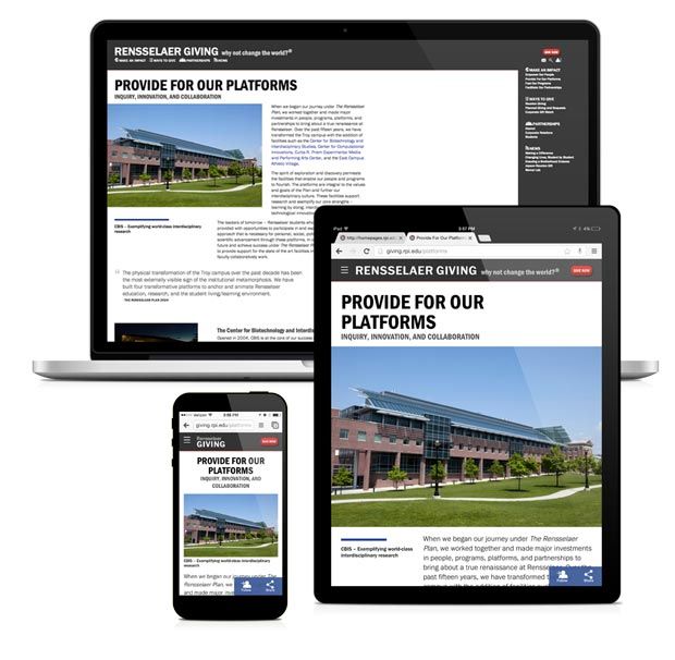
Inspired by magazines, article pages break up larger amounts of text into content that can be ready quickly or thoroughly.
Hybrid Page
The directory and article page types can be combined and repeated. One recommended example is to finish an article with a grid of next links.
The Table is Set, Time to Eat
In my view (and the team’s), the site design is a good vehicle to deliver content and is consistent with the Rensselaer brand. Users can access content on a range of devices, screen sizes, and browsers. And the content is designed to be useful to users with various attention levels. The design forms the backbone of the division’s web brand and will be branched for Alumni and Parents.
The design delivery includes:
The success of these sites will ultimately rest on having quality, scannable content. For better content check out:
Learn more about creating effective media, view my Production Remarks.