Reduce the Clutter
Less is More Conversions
March 8, 2017
I’ve previously written that reducing the number of fields increases conversions. I’ve also found that reducing the content of a page with a form is likely to increase conversions as well.
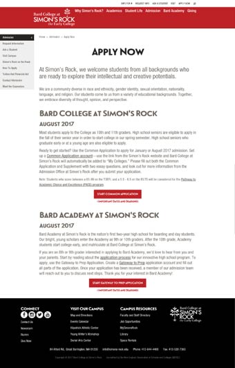
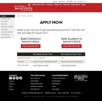
Simplifying the Content Increased Conversions
Designing the information so that it is quick and easy to digest may increase conversions. In this case, I distilled two paragraphs into a table and conversions increased.
Moving Form ‘Above the Fold’
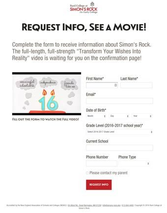
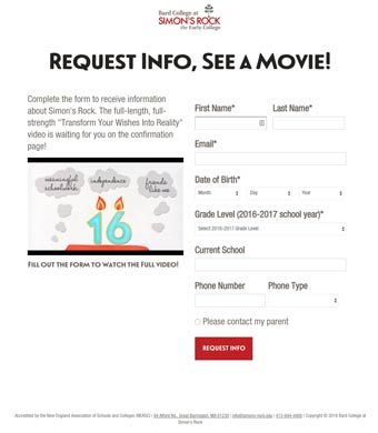
While people do scroll, sifting through information creates a barrier to get to a conversion form. I ran three tests that found that removing content so that the form was higher up on the page increased conversions.
Remove Breadcrumb Links Increased Conversions
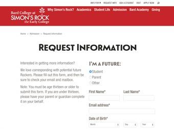
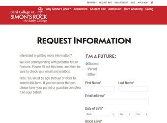
Remove Enticement Paragraph Increased Conversions


Push Content to Side Column Increased Conversions
Learn more about using data to assess and inform tactics view my Analytics Remarks.